Christina Lake Cannabis
A new visual identity
A new cannabis company based in British Columbia, Christina Lake Cannabis needed a visual identity before launching. We had to figure out who CLC was as a business and what they wanted the world and their partners to know.
Christina Lake's growing process is unique within the Canadian cannabis industry: they grow all their product outside, in the BC climate. Being "sun grown" is a business advantage in terms of less overhead (literally and financially), and it means incredibly high yields, higher than indoor-grown cannabis.
We also turned to the BC environment - Christina Lake is a real lake nestled within small mountains - the unique geography of the area is a big contributor to the quality and characteristics of the cannabis.
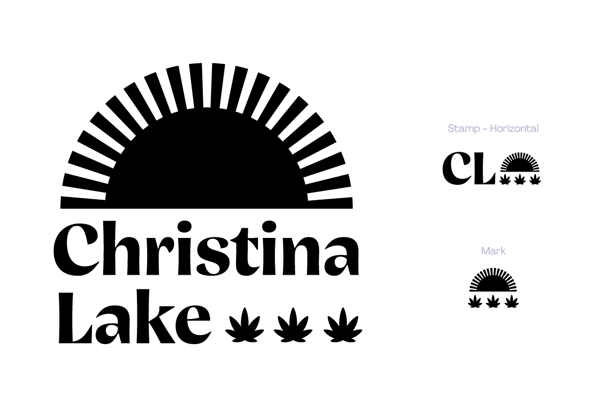
CLC is primarily a B2B company, so design for packaging or advertising weren't top concerns in their brand development. Add to that heavy regulations for branding on cannabis products and we had to work out how CLC's values could be communicated in a simple brand mark.
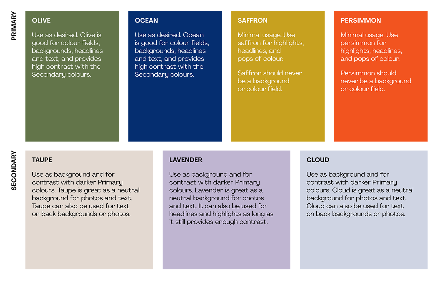
Colours & Photography
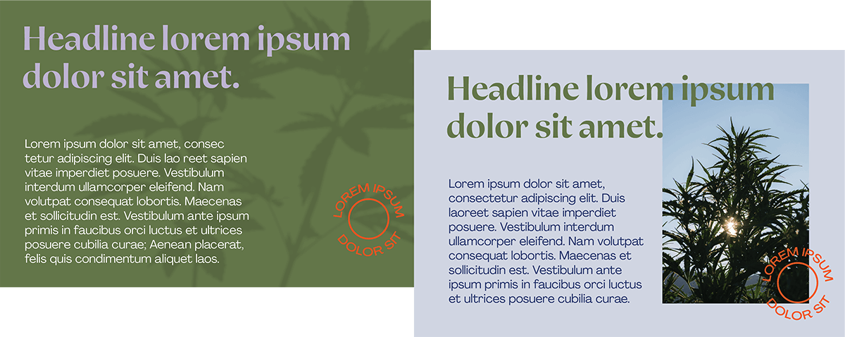
We ultimately landed on a very bright brand palette to capture the feeling of "sun grown". Guidelines for photography were important to communicate the attitude of CLC - image colours were subdued to emphasize the agricultural feel of the company (verdant versus saturated) and whitespace was used liberally across all pieces to add a level of refinement and elegance. It would be easy with a brand based on sun to be overly colourful and happy, but we wanted to temper the brightness with a seriousness.
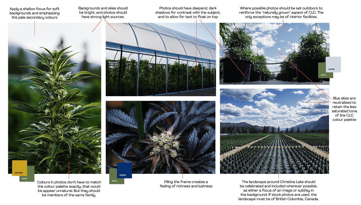
Rules reguarding photography were important to establish, to communicate the sun-grown, BC-based environment while maintaining the "sunny and sophisticated" brand.
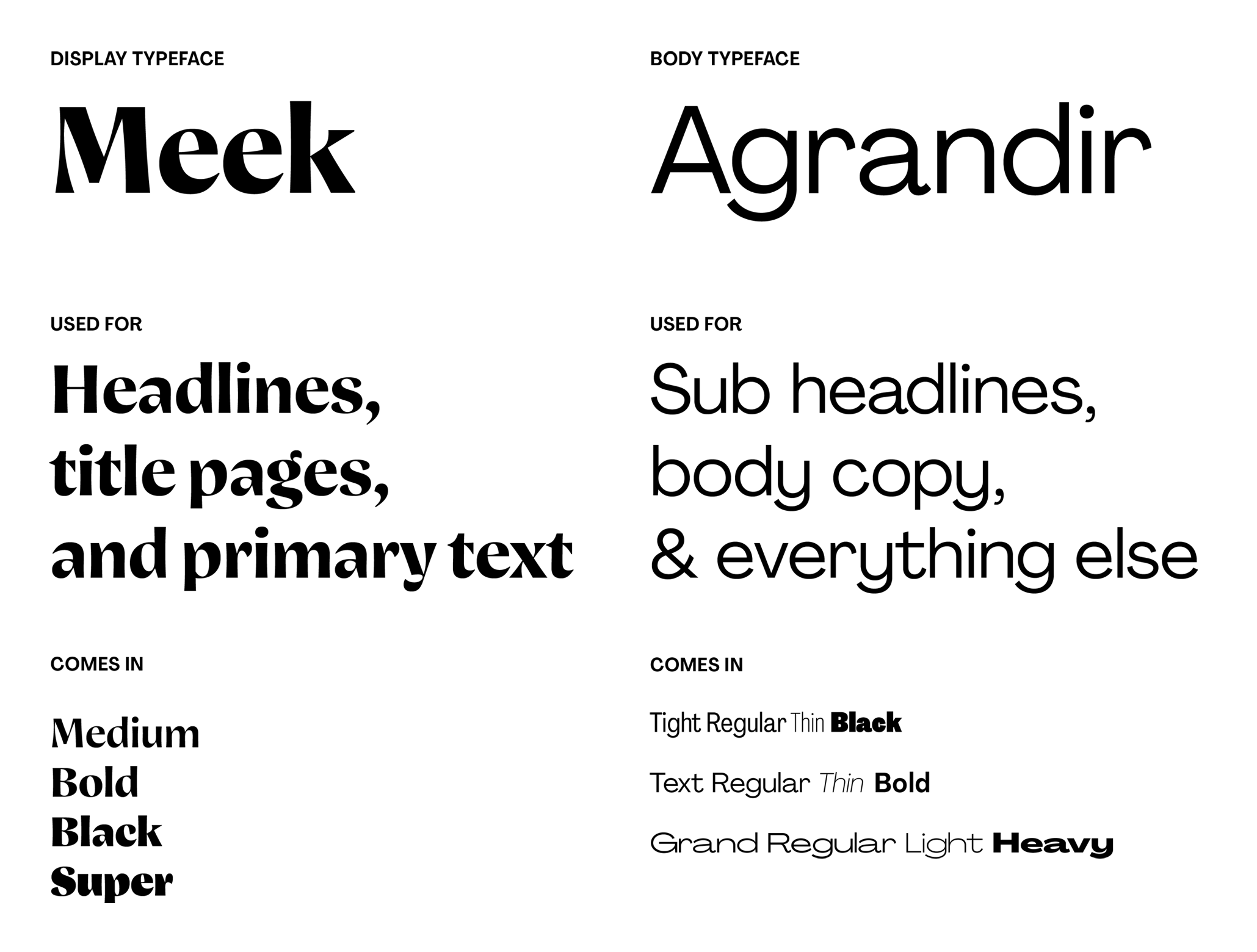
Typography
I settled on two typefaces for this project: Meek for headlines and Agrandir for body copy and everything else.
I wanted something with a lot of character for CLC's headline font - within the cannabis industry, since norms aren't yet established, there's a lot of room to be playful and come up with something unique. A playful and slightly strange font like Meek provided a sense of lightness that compliments the sunshine-forward positioning of the brand, without being outright silly.
Agrandir serves as a great companion, with it's wide varity of fonts and weights which make it great for myriad purposes.
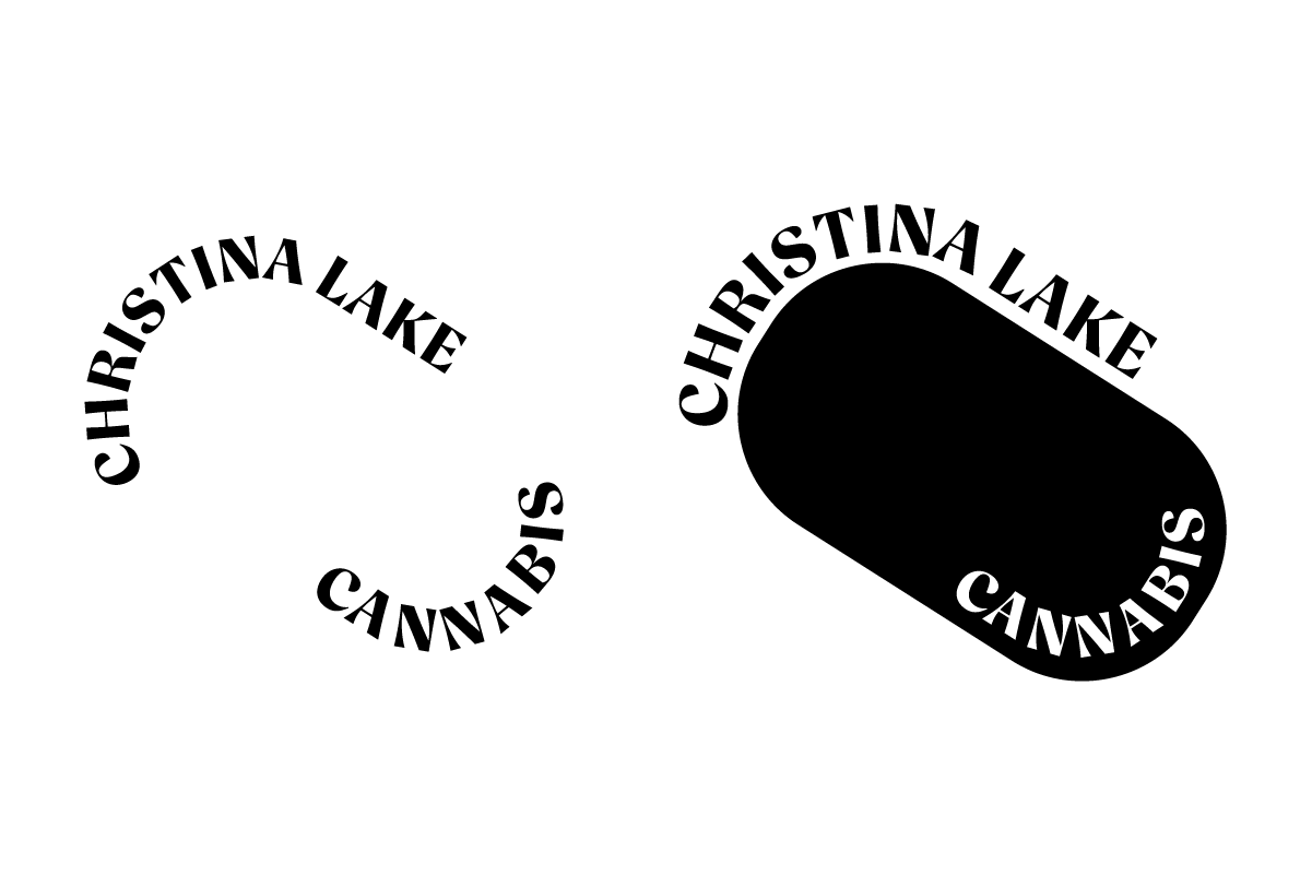
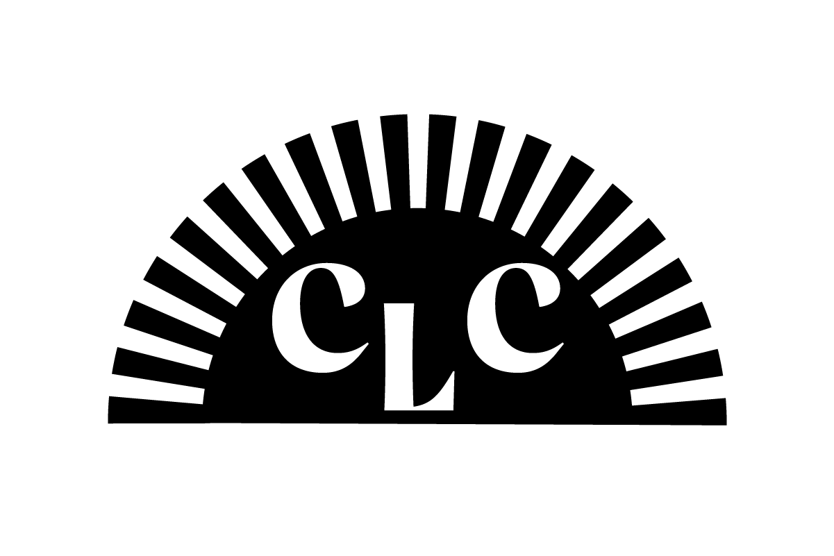
Logo
We went through a few rounds on the logo, focusing on the "sun grown" quality of the product, and in a few instances including references to the lake. Leaning on the typography we'd already established, we provided the client with a handful of options.

*
Branding & Identity
Art Direction
Web Design
Editorial Design
Illustration
Infographics
On-set direction
HTML & CSS
*
Winner of Silver Davey Award (website: sustainability) for Ecology & Society, 2023
Winner of Silver Davey Award (website: science) for Ecology & Society, 2023
Familiar with Figma, Sketch, Photoshop, Illustrator, InDesign, Wordpress, Webflow, and AODA (accessibility) requirements for print and web.
*
Bachelor of Design in Graphic Design
OCAD University, 2011.
Margot holds dual citizenship in both Canada and the United Kingdom and is legally eligible for work in both countries. She currently lives in Toronto, Canada.
*
2011 - Present:
Senior Designer, Square
Senior Designer, Office/Bureau
Senior Art Director, H+K Strategies
Instructor, Toronto Film School
Art Director, Publicis
Art Director, Juniper Park\TBWA
Designer, Critical Mass
Designer, Indigo Books & Music
Lead Designer, Blue Ant Media
Designer, WIND Mobile